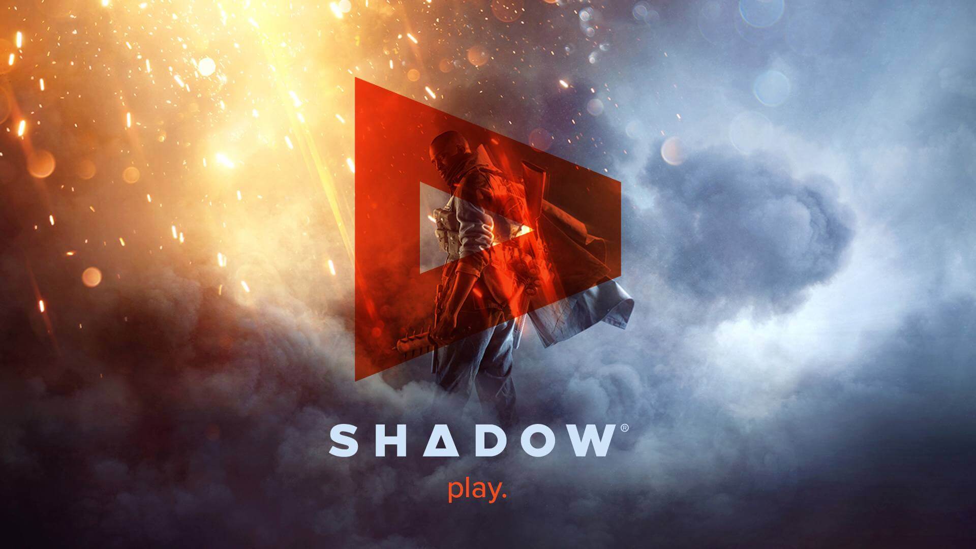
Shadow
BLADE GROUP - 2017
Identity
Product Design
UI & UX
Shadow is a product created by a company called Blade Group, based in Paris. Their product is a cloud-based gaming PC that allows users to connect to it from their personal computer, MAC, smartphone, or through the proprietary shadow box they sell.
OPPORTUNITY
Expand to other markets.
This case study will present the body of work and process used to re-brand shadow.
I was recruited at a pivotal time, as they wanted to expand their target market. Tasked with re-branding, shaping of the second version of the 'shadow box' and working on designing the new UI/UX of their apps on all platforms (iOS, Android, Mac & PC).
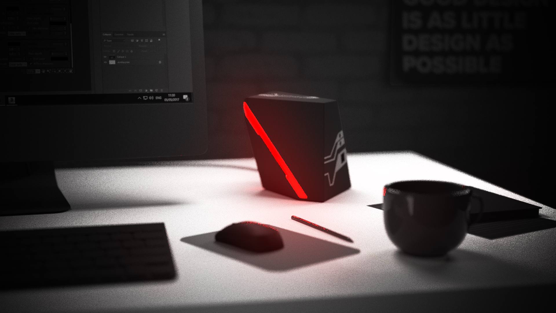
Initially, the brand has been built around gaming and all the visuals reflect the gamer aesthetic; dark backgrounds, black & red colors, and a tone of voice that is a signature of the gaming community. The start-up took off with this strategy and reached the market with the first version of the shadow box and the app service.
*Note: The work here was never released into production.
Product overview
The video demonstrates the features and highlights the strentghs of the product.
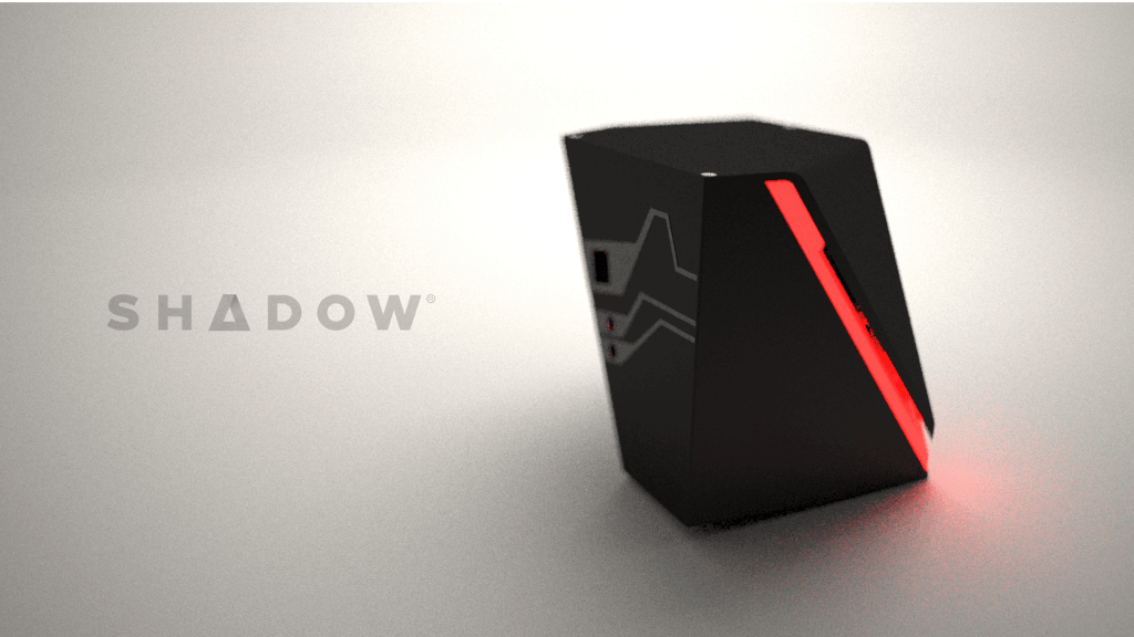
The brand.
When deep divining into their branding, we can see that it is scarce, incomplete, and suffers from poor graphical representation. The logo itself is unbalanced and uninspiring due to the combination of a thin retro typeface and a visually heavy round element. The targeted market is the gaming sector, which generally is more accepting of creativity. Black & red used heavily here speaks directly to this market.


LOGO ISSUES
Not easily read
Unbalanced
Not recognizable
Disconnect with the product
No story
The logo is plagued with issues such as readability at small scales or recognizability. What does this logo say about the product and how does the branding display the qualities of the product to users? The overall feel is that of a sketch.

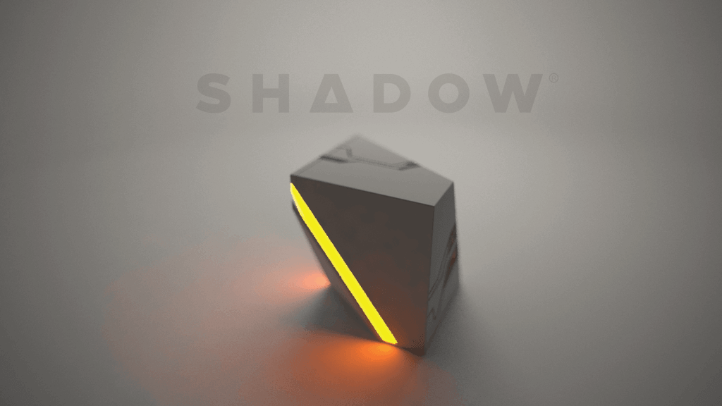
A NEW DIRECTION.
Initially, the focus was gaming, but the founders now take aim at other markets. They needed to switch from marketing the product as the future of the gaming PC to displaying their product as a powerful tool for creatives, business, and personal use.
Gaming
The gaming community is an important part of the brand since they are part of the early-adopters.
Business
A wave of business-oriented cloud services can be seen throughout the industry thus the company wishes to capitalize on this new opportunity.
Personal
This category covers home use of the shadow box, such as being plugged in a TV or used as a regular PC; being used app-only on a client’s current PC/MAC in order to have access to more horsepower for running 3D apps or creative tools such as Photoshop.
WORDS OF WISDOM — JEFF BEZOS
Your brand is what other people say about you when you're not in the room.
New umbrella logo.
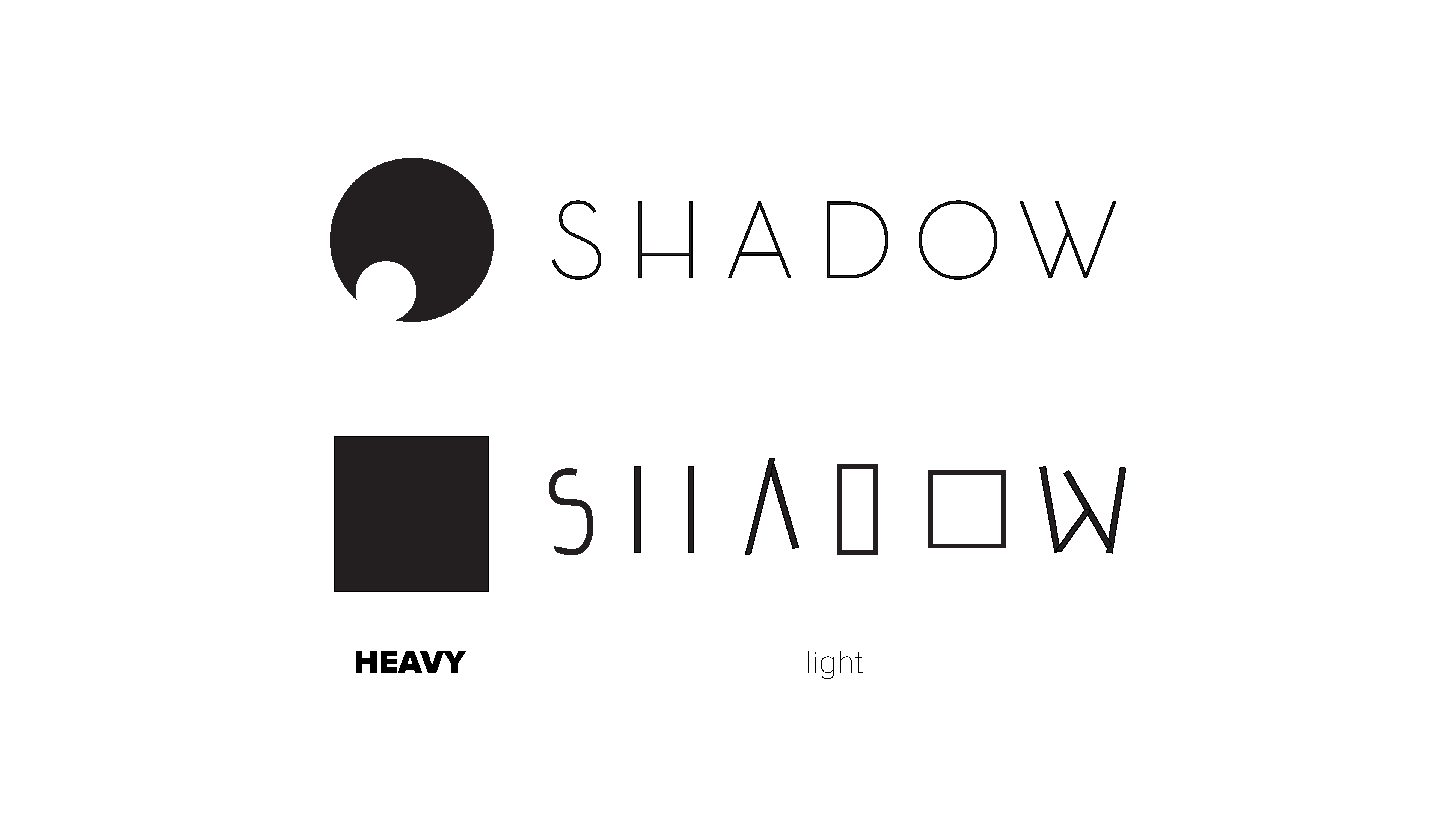
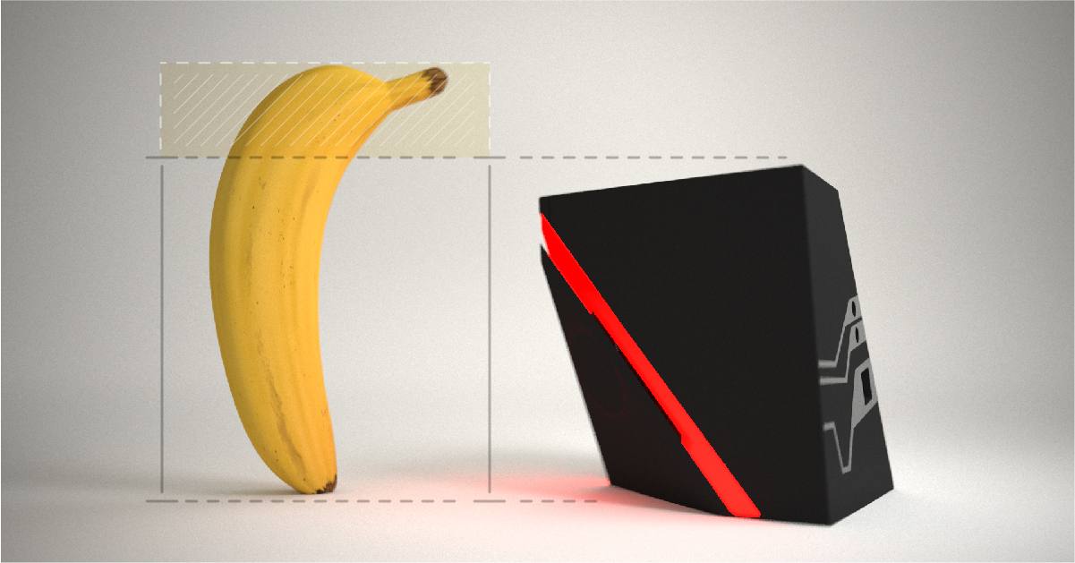
Moving away from the old branding, I took a bold approach in the artistic direction thus steering the identity into the 21st century with clean lines and geometric shapes. The old identity had a lot of contrast in terms of geometric shape (round vs square) with the product they sell (shadow box) which is triangular and boxy.
I’ve used the product as a base for the new identity in order to create harmony. The new logo is based on a thicker more contemporary typeface. The look is meant to inspire confidence, elegance, and power. Above is the main corporate version, on a light gray base color along with the new logomark replacing the “A” letter. The letter-spacing is increased, giving it an imposing stature and demanding respect from the viewer; infusing the logo with class.
The slightly overlapping sides of the triangle add silky softness and a 3D effect. The shapes are symbolic of a powerful platform that has a multitude of facets and uses. The main criticism, received on this logomark, is a resemblance to the google drive logo, which happens to be a triangle. I’ll let you decide.
Secondary 'wide' version.
Logo system
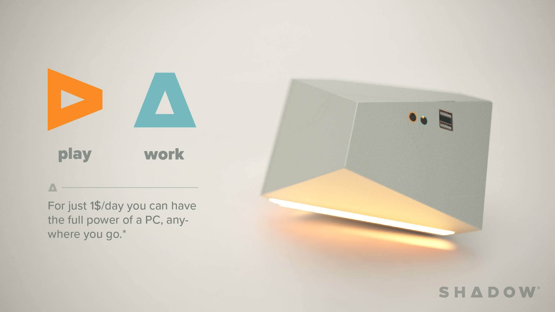
I opted on creating a logo system based on the main triangle shape. This approach allows for the ability to differentiate the offers (gaming, business, personal) while keeping brand consistency. The triangle shape brings some interesting use cases such as turning it on its side creating a play button. The Shadow create logo variation is similar to a fast-forward button, it is a wink to creatives who are forward-thinking and designing the future. There is symbolism in every variation, which infuses the logomarks with strength and personality.
Consistency is at the core of success revolving around a company that wants to appeal to a broader audience. Diversifying the target-market can be deadly, but that’s where strong and proper branding can create a positive climate for the fan base to accept change, while being attractive to newcomers.

Color Theory.
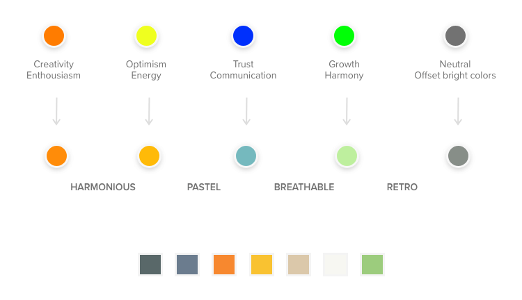
The branding needed to be re-defined in terms of color palette, leaving the black & red behind. I opted on creating a mature, playful, and versatile palette. Thoughtfully choosing shades that can be used to appeal to each targeted market.
I started with some primary colors, with meanings that could appeal to the potential users. I’ve worked on tweaking these colors in order to harmonize them and decided to follow down a pastel path in order to keep a little of the retro vibe (but not that retro typeface) but modernize it.
Ads & marketing.
When building the brand, one has to consider how the brand will be used online and also on the streets. Creating a robust framework alongside clear guidelines can save a lot of headaches in the long run and serve as insurance for brand consistency.
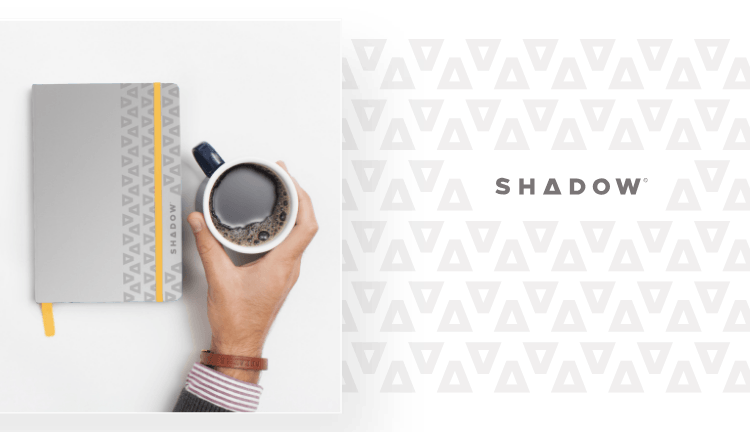
A pattern that can be used across products and advertising can be an invaluable tool. Using the basic logomark as a pattern so that it can be printed on goodies, posters, booklets, and even on air vents or finishing touches on the physical product.
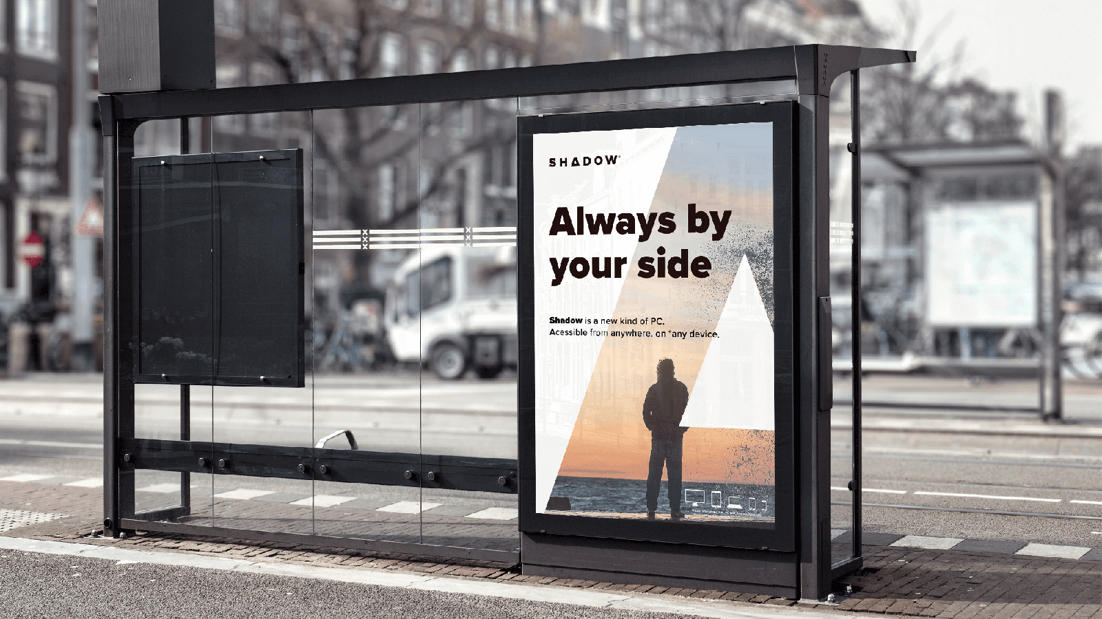
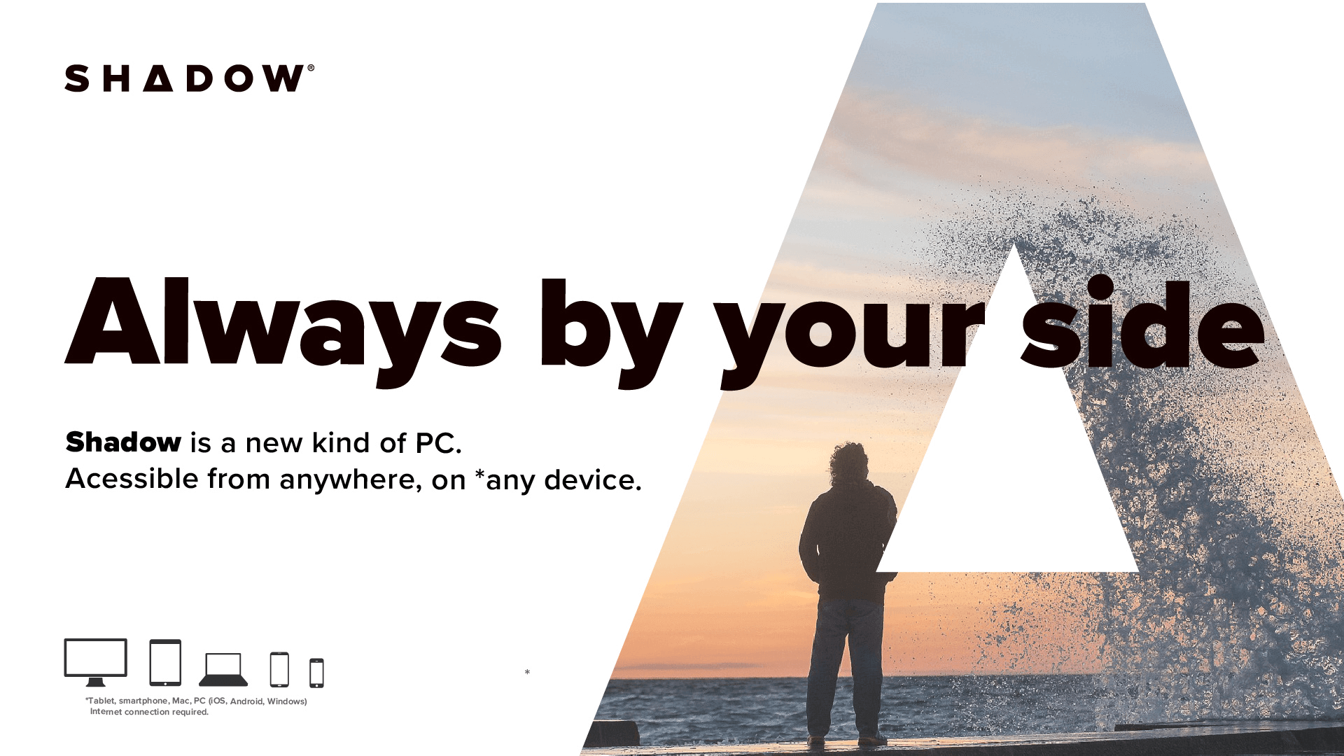
Digital & print ads
In the time that was allocated to me, marketing and ads were set in the backseat, but I did get to do a little exploration. Below are various mock-ups of how the new logomark and brand guidelines would be displayed in various advertising shapes and forms.
App UI/UX.
Branding isn’t only about the look and style of a brand. For branding to be successful and generate customer loyalty in the same way famous companies (Apple, Beats by Dre, Nike, etc.) have managed to do, the branding needs to seep in every product (or service) crack and corner. The fusion between brand and product should be the goal of every designer, no matter what type of work they are doing; illustration, copywriting, UX, UI, and others should strive for consistency with the brand story.
Vision
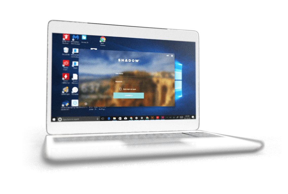
My idea was to have a window where the user inputs their login & password with a blurry background. The image displayed is actually the desktop background on the cloud PC. Once logged in, the screen inside the window would grow and animate similar to a portal opening to the shadow cloud PC. A yellow border would differentiate the shadow portal when in windowed mode. The top bar serves as a placement for various parameters. The bar auto-hides and it appears when rolling the mouse at the top-center of the screen.
Shown here, is the login experience I was perfecting for the app which allows the user to login onto his cloud PC (his/her shadow) from any Mac or Windows operating system.
Various pieces of exploration.
Working on this project I have designed and produced a lot of different things using numerous methods. From designing the logo in Illustrator, creating prototypes in Adobe XD to making 3D renders in 3DsMax. Below you will find a proof of some of that work.


Conclusion.
Re-branding can be difficult since it’s a delicate balance between the users that love the old brand and the unlimited possibilities of future growth. Start out by analyzing the history of the brand, it’s user base, and current style while keeping an eye on the new objectives. The research and data you gather on how the brand is perceived can help shape the future look & feel of the new identity. Blend parts of the old with the new with surprising results. Most importantly, don’t be afraid to make mistakes! Experimentation is the path to greatness.