Steam is the Valve corporation's marketplace.
When 2-factor authentication became adopted, Valve released a companion mobile app.
The main function of the app is to generate a code that allows you to login on a PC. They also wanted to incorporate marketplace options of the PC version onto the app. This redesign aims to tackle the complexities of distilling features from PC to mobile.
The current experience leaves a lot to be desired.
A quick glance at the app quickly uncovers the shortcomings of the current experience.
BEFORE
Main functions are buried
UI inconsistencies
Modern best practices ???
Bland


AFTER
Sleek UI
Improved UX
Big bold images
Easy access
Great design begins with a story.

THE HERO
A gamer looking for adventure and excitement

THE PROMISE
A platform that can take you on numerous exciting adventures

THE GUIDE
A passionate game developer who loves a good story

THE BASELINE
Jump in.
Adventure awaits!
What is Steam?
Steam is a video game digital distribution platform developed by Valve Corporation. It was launched in September 2003 as a way for Valve to provide automatic updates to their games but eventually expanded to include non-Valve games from third-party publishers.
Power to the people.
What do the users think? I looked at comments from the play store on android.
Other good sources are Reddit forums and Steam's forums.
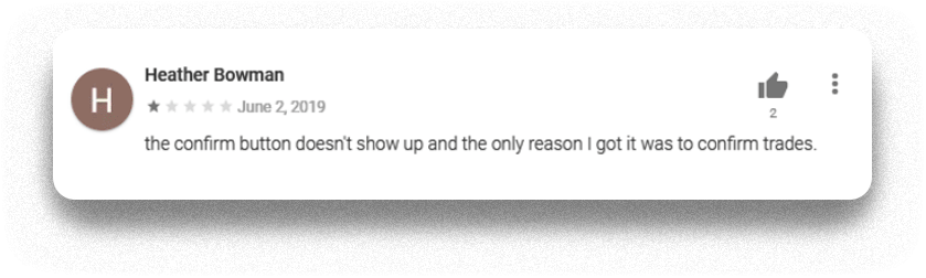
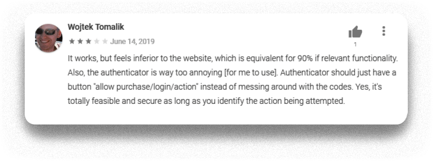
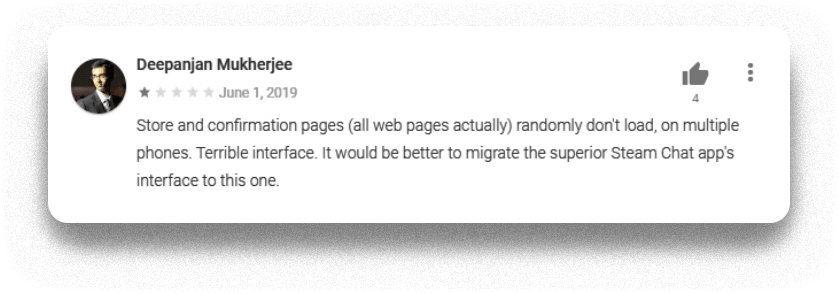
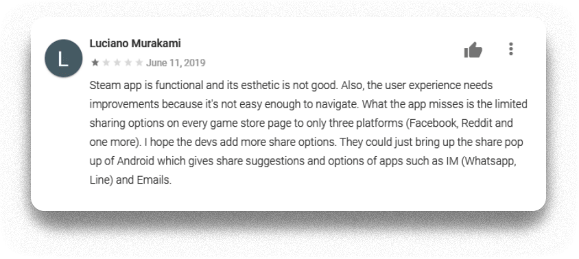

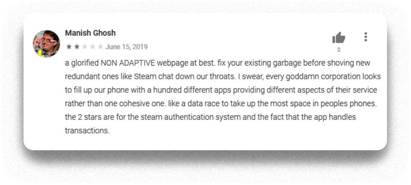


Key Mentions
Steam Guard unease of use
Item/trade confirmation
Dislike for the web app style
Bad mobile UI/UX
Define.
Definition
Steam users use the app as a companion to the desktop experience because they need it for securing their account, trading, checking sales & purchasing adventures.
Main functions
- Steam Guard
- Item listing confirmation
- Shopping experience
- Interaction with Friends
- Notifications
Secondary
- Account creation
- Library
- Community
- Support
Solve the puzzle.
I have reflected on the menu organization and how features are presented. There are redundancies and each function has its own separate screen.
The key to organizing the features was to combine & display them together.
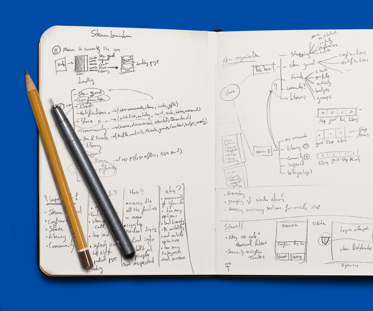
CURRENT NAVIGATION EXPERIENCE

NAVIGATION EXPERIENCE REVAMPED

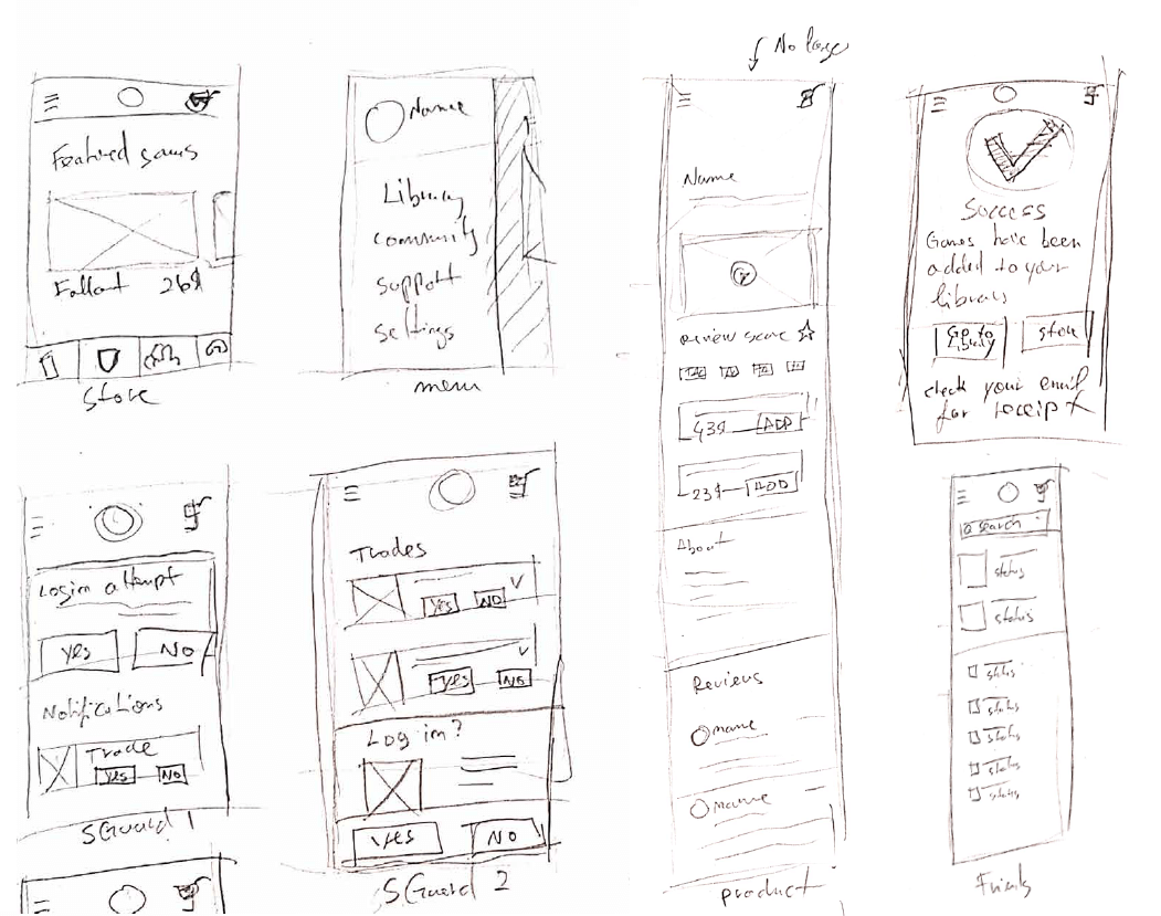
Rough sketches.
Sketching has allowed me to explore layout for the Steam Guard. This screen will now host notifications (trade, item listings, logins).
Wireframing brings clarity and speeds up the process of constructing a final design.
Components are pieces that build the cake.
The cake isn't a lie.

The Result.
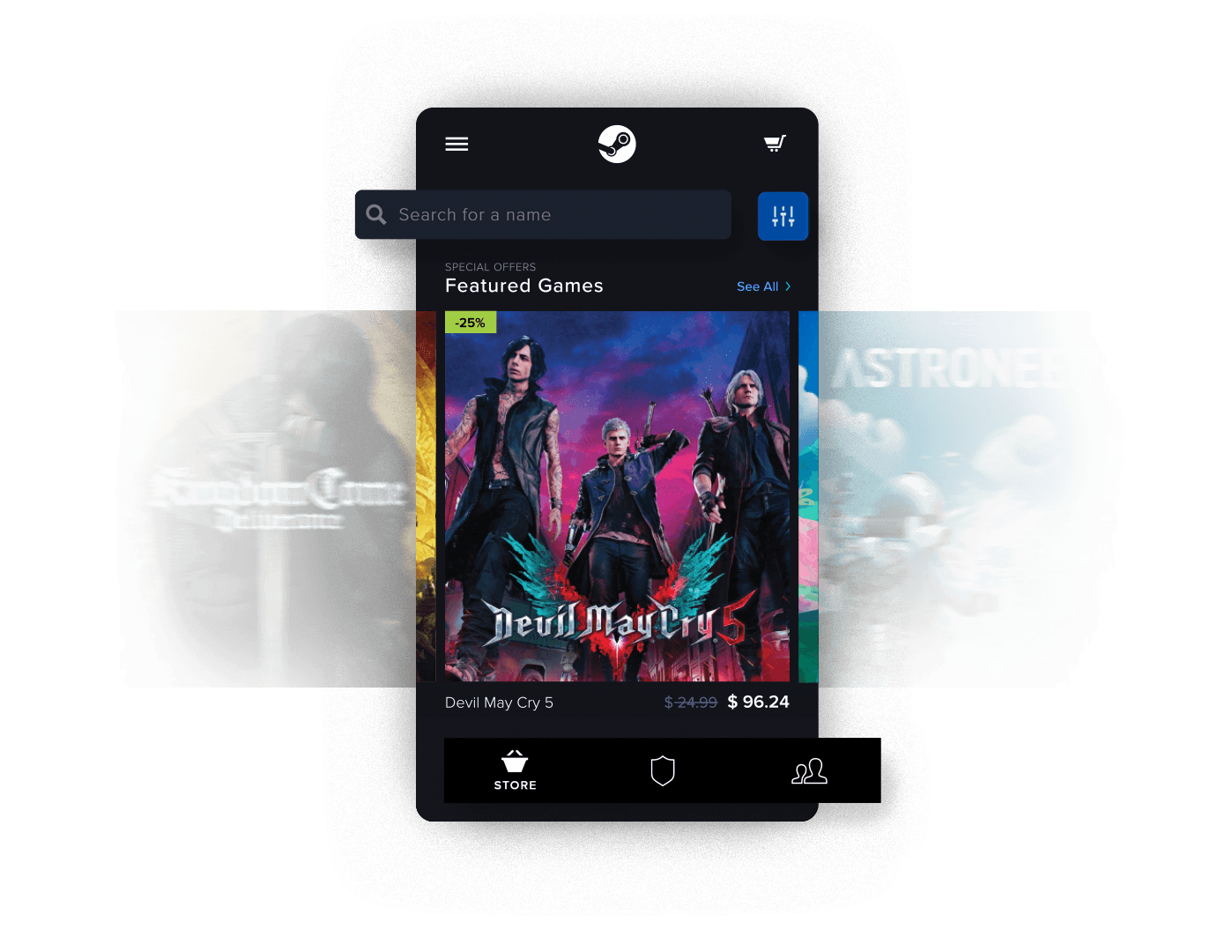
The new design focuses on adventures. Aiming to help users pick and launch these experiences faster; removing hurdles.
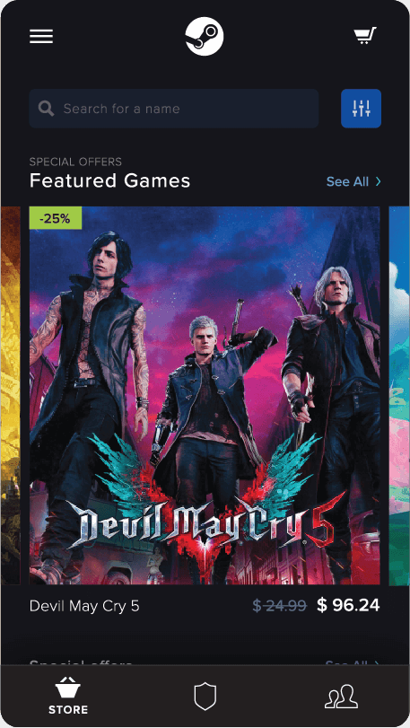
LANDING
Large images show the personality of the games, portraying them as great adventures the user can embark on.
Tab bar now houses primary functions.
PRODUCT PAGE
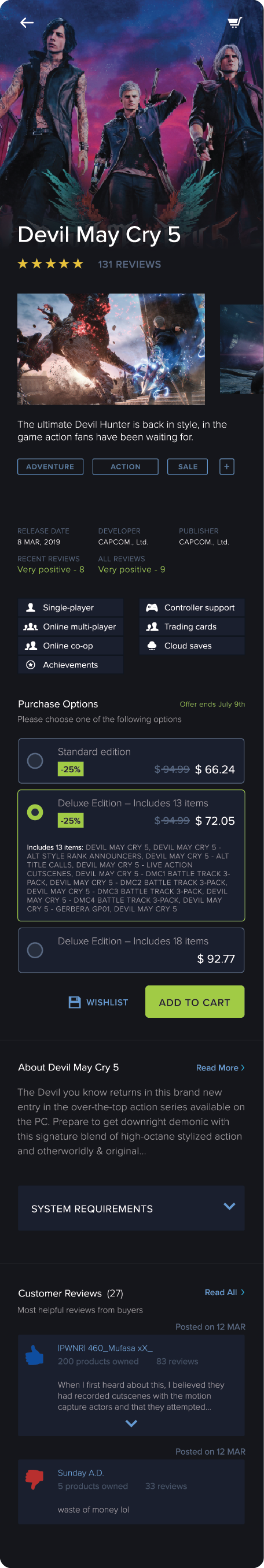
- The product screen is tailored to provide basic information to trigger a purchasing decision.
- Large Netflix inspired hero image; this section can display a cinemagraph or short video extract.
- The information hierarchy is heavily inspired by amazon. Key information presented before presenting purchasing options.
- The purchasing system is redesigned to fit the mobile screen real estate. Information hierarchy alongside copy improvements produced cleaner, easier to understand UI.
2 FACTOR AUTH.
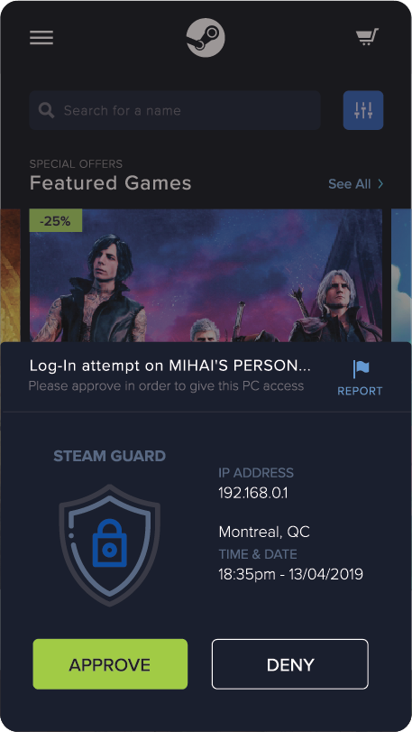
Spontaneous adventures are the best! The ‘enter this code on desktop’ UX seems like a slowdown. The new system is one click to adventure. Instead of using a screen with a code that refreshes over time, a simple pop-up with basic information and CTA’s reduces clutter in the app.
The design also includes a report button for suspicious activity. This allows users to take the necessary steps to secure their accounts quickly.
STEAM GUARD SECURITY HUB
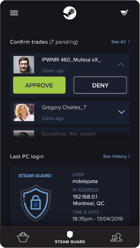
What used to be the Steam Guard screen showing a security code the users need to type on PC, now became a hub for security-related functions.
Confirming trades has never been easier. When users receive a trade request the Steam Guard screen should be the first thing they see upon opening the app.
Top three latest trade/item confirmation requests are shown at a glance. The tertiary level button allows users to see all trade history. The last login attempt is shown on this screen and the a log of all logins made can be accessed here.
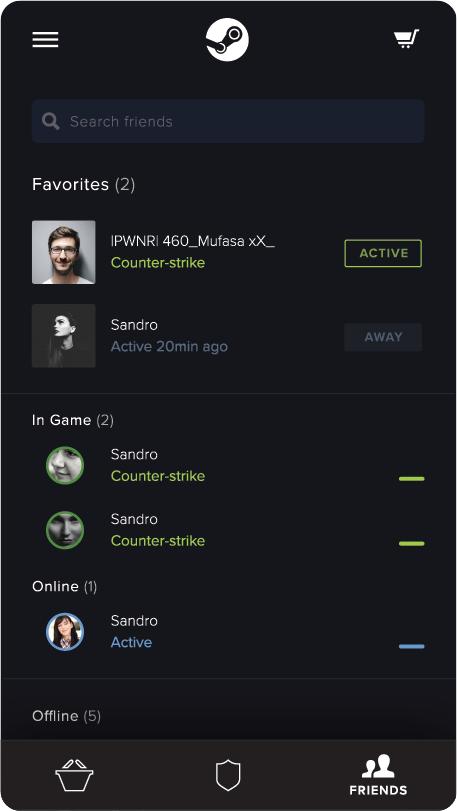
Consistent with the store landing page, the friend screen shows the search bar placed at the top, followed by ‘Favorites’. In this section, the profile images are larger and square. Accompanying them, a status label showing their activity.
FRIENDS
HAMBURGER MENU
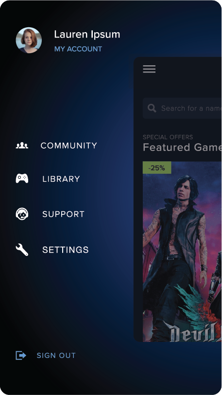
The menu is home to your account options alongside other secondary features. Some were out-of-scope for the amount of time allocated to this MVP.