Unification
EGENCIA — 2018
Product Design
UI & UX
Egencia, corporate travel from Expedia Group, is reimagining business travel management to make business travelers happier and corporate travel programs more successful. Egencia offers more personalized experiences through curated access to the world’s most relevant travel options.
OPPORTUNITY
Bring consistency and continuity to the product.
The shopping lines of business (rail, air, car & ground) having had a re-coded back-end, gave us the opportunity to work on improving the design. The project is focused on unifying the patterns used in our shopping paths. This was a project launched by the Paris team (which I was part of). We each designed different solutions, followed by workshops. We built components based on the needs of each part of the product (air, rail, car & ground). The layout and laws were defined to accommodate all the parts of the product and to create consistency.
Meet the former Parisian team


Product overview
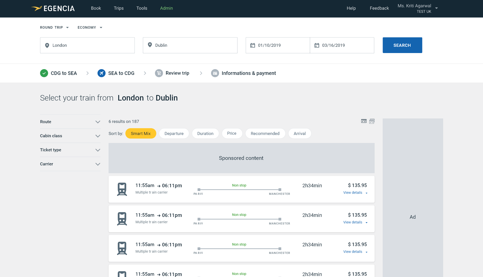
Shown here is the interface before the unification and consistency initiative started. Pay close attention to the discrepancies between the various screens; you will notice that there is a lack of standardization.
Five
Variations tested
95/100
Usability score
Based on user testing the booking flow
+$40M
Estimated revenue
Based on A/B testing
BEFORE
Inconsistencies
Bad hierarchy
Calls for clarity
Bland

AFTER
Better UX
Improved clarity
Organised
Glancable
WORDS OF WISDOM — DIETER RAMS
"Indifference towards people and the reality in which they live is actually the one and only cardinal sin in design."
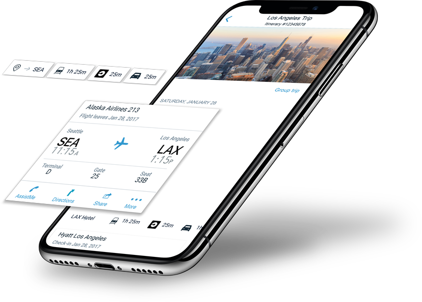
USER JOURNEY
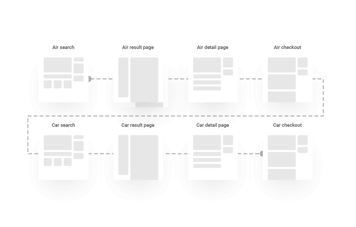
The old booking flow wasn’t designed to handle the booking of multiple products. Ex: if a user wants to book a flight and rent a car, he currently has to go over the entire booking flow twice.
NEW USER JOURNEY
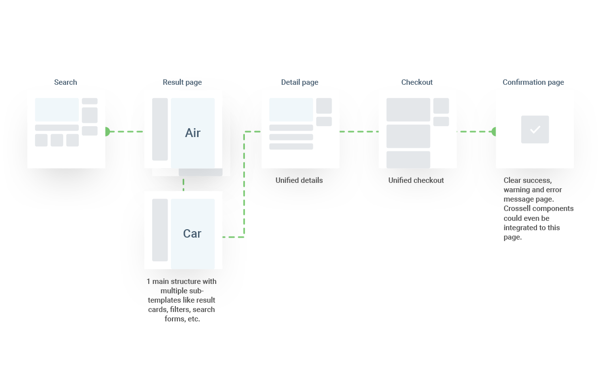
Based on gathered feedback we are now able to give our first recommendation on what could be the future shopping path look like. Users should have one global experience with common UX patterns.
Unifying our page and layout design.
Components shared within the product (such as filters, search bars, etc.) and their placement, was optimized while working closely with the transportation teams in Paris. With their help, we conducted A/B tests of these new patterns from which all parts of the product can benefit. The aim is to apply the resulting knowledge globally.
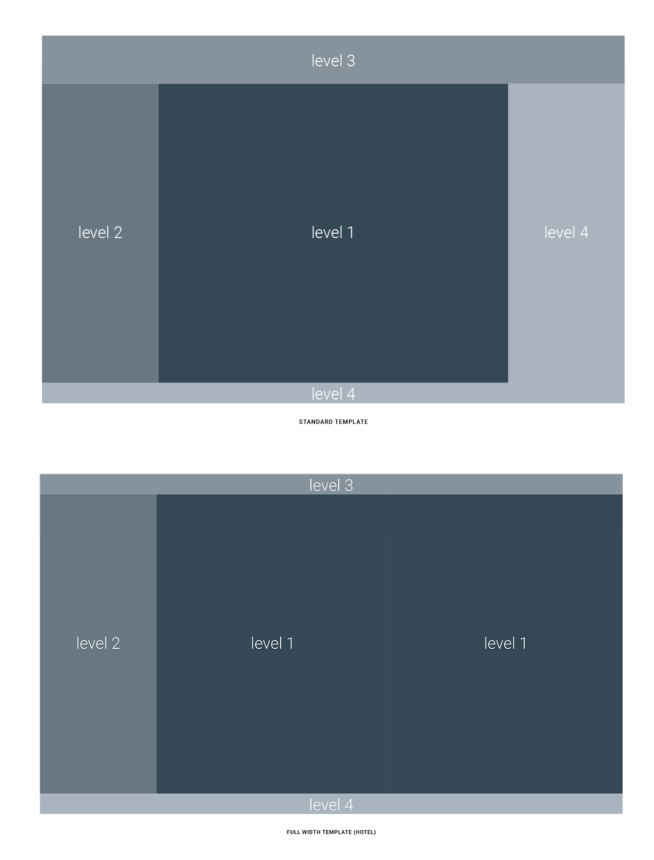
LEVEL 1
Contains the result area
LEVEL 2
Dedicated to filtering components
LEVEL 3
Contains the search options.
LEVEL 4
Dedicated to information that doesn’t impact the booking (ads or contextual help)
Applying the same treatment to the cards.
Good informational hierarchy helps users find what they need at a glance. Additionally, it allows users to learn exactly where to find information when consistently displayed in the same place within the card.
LOW DENSITY LAYOUT


LOW DENSITY MOBILE LAYOUT

HIGH DENSITY LAYOUT


HIGH DENSITY MOBILE LAYOUT

The Result.
A consistent design across all of transportation. Minimising time-to-booking and reducing friction points.
We applied this treatment to our transportation pages; Rail, Air & Car. All the information is displayed the same and is found in the same place on each part of the product. This will reduce the amount of time for the booking. The 'stepper' component shows the user exactly where they are in the booking process.
OLD HOTEL EXPERIENCE
UNIFIED VERSION
A big change was having the map on the right-hand side. This allows us to hide it whenever a user selects a hotel, and display more information while allowing them to click through the other options to compare offers.
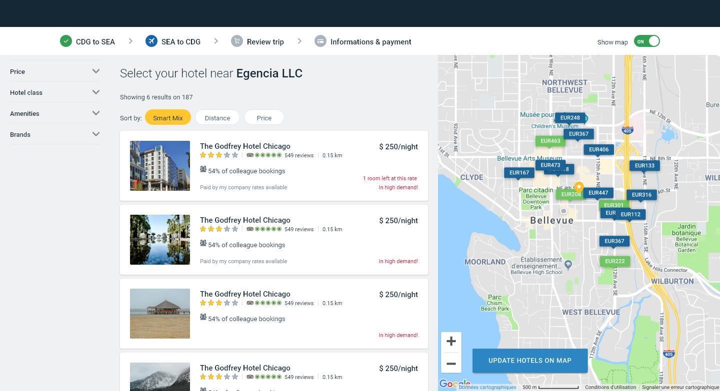
The structure is slightly different from transportation, to accommodate for the map. However, the user can find the filters in the same spot and the results in the middle. Even with a different layout, the consistency is maintained.